Today, we’re releasing our 2024 Wins Above Replacement (WAR) candidate quality models, for both the House and the Senate. For those of you unfamiliar with the concept, here’s a brief primer: our models assemble a “fundamentals”-based outcome estimate for a race by controlling for seat partisanship, incumbency, demographics, and money and help us project how a race “should” have gone this year. We then evaluate the actual result against the fundamentals-based estimate, which allows us to quantify the impact of candidate quality for each election.


You can find our previous WAR models for the 2018, 2020, and 2022 cycles under the “Projects” tab on our website. You can also check out our 2024 interactive maps for the 2024 House here and the Senate here. We’ll have a lot of analysis coming up on the findings we’ve gleaned from, but below, we’ll share some initial thoughts.
***
One thing quickly became clear when doing our 2024 post-mortem: downballot Democrats punched well above their weight, given Trump’s 1.5% national vote victory. Had congressional Republicans simply won the same districts and states Trump carried, they’d be sitting with 230 House seats and 57 Senate seats right now; instead, they’re at 220 and 53, respectively.
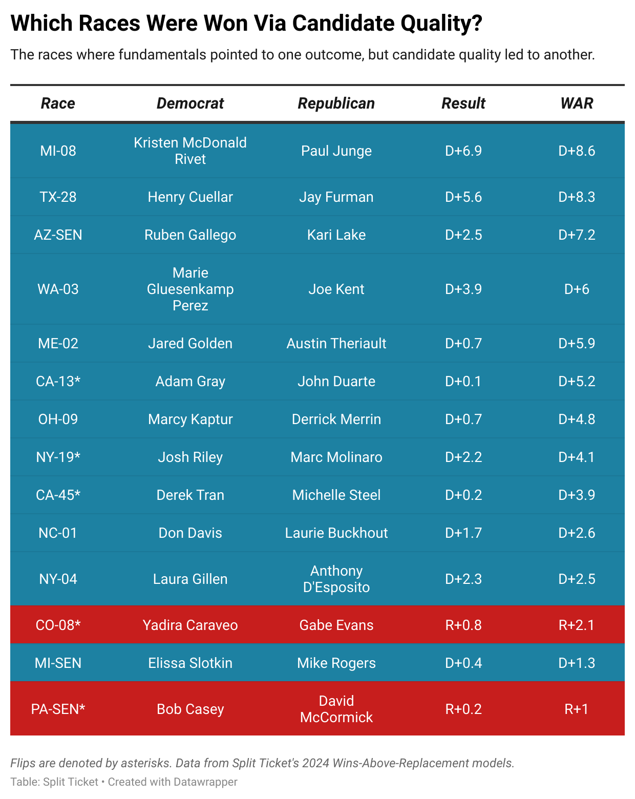
So when we sat down to make the WAR models, it came as no surprise that Democrats once again significantly overperformed in battleground elections. There were 11 House elections where candidate quality was the decisive factor; 10 of those were won by Democrats, and only one was won by Republicans. At the Senate level, Democrats won two seats on the back of candidate quality, while Republicans won one.
I suppose this isn’t too surprising. People may question some of Kamala Harris’s decisions, whether from 2019 or 2024, but downballot Democrats mostly played an exceptionally strong game given the hands they were dealt. Had you told me before the election that the GOP would win the House vote by 2%, I would have expected them to win significantly more seats than this.
But in election after election, battleground Democrats mostly overperformed, while Republicans saw their candidates lose extremely winnable races — continuing a story we’ve seen for a few cycles now. We’ve spilled enough ink on why that is, but it’s mostly that, for all the flaws of the Democratic Party, they’ve been much more willing to prioritize electability, giving their candidates leeway to push back against their party in a way that Republicans generally don’t.
Here’s a striking statistic to reinforce that finding: in the 69 “battleground” House districts (rated by the Cook Political Report as tossup, lean, or likely for either side), the average WAR was D+2.4, while in the 328 other contested seats, it was R+0.3. This is how Democrats came within a few thousand votes of flipping the House, despite a national environment of R+2.
There weren’t too many surprises this time around, but designing this model was probably the hardest modeling task we’ve faced in quite some time. This is mostly because there was a realignment with nonwhite voters that saw them take massive steps to the right. Every time this happens on either side, we see that it takes a while for such changes to flow downballot — voters usually don’t abandon their past allegiances that easily. Hence, the concept of downballot lag (where downballot candidates run significantly ahead of the top of the ticket during a realignment).
That means the raw difference between the presidential result and the downballot margin in an election was significantly less important in determining a WAR score than one might think — for instance, a Democratic incumbent outrunning Harris by 7 in a seat that took a 23 point swing to the right is far less impressive than one outrunning Harris by 6 in a seat that took a 1 point swing to the left. Not knowing this can lead to all sorts of absurd takes, like those praising the electoral strength of candidates who did nothing special beyond representing districts that shot to the right.
That’s where I think our models have the most value. Before this, there just wasn’t a way to “quantify” electability, and every metric people used was fraught with danger. You have to find a way to simultaneously control for demographics, partisanship, downballot lag, incumbency, and absurd financial disparities from token opposition in order to figure out which candidates truly overperform. That’s what our models do, and we hope you find them informative.
Here are some observations that I found interesting when looking through the model’s findings:
- Unlike in 2022, progressives broadly seem to have had a pretty disappointing election. I do not think this is solely down to environmental factors — they made some exceptionally questionable choices this time around, including their decision to double down on supporting Biden’s candidacy post-debate.
- You can argue that the Democrats were extremely lucky to finish with 215 seats. But I would also argue that Republicans were really lucky to hold the House despite having some awful candidates. The GOP came within a few thousand votes of losing exceptionally weak incumbents in IA-01, WI-03, and PA-10, which would have tipped the House to the Democrats.
- On that note, this is the fourth consecutive election in which the Republican Party has cost themselves high-profile seats through candidate quality gaps. They were bailed out by Trump winning the popular vote against Harris, and they might have to pull an inside straight to keep the House in what’s likely to be a blue 2026.
- Incumbents tended to keep roughly half of their overperformance from the previous cycle, which is about in line with what I’d expect, especially given that this is a metric that measures the difference in candidate quality between two candidates.
One last note: this cycle, incumbency was worth about 3% in margin. That’s not too different from what it was in previous years. But it reinforces how electorally vital it was for Democrats to have Jon Ossoff in that Georgia Senate seat right now instead of David Perdue, because that’s a 6% swing, in theory, that they’ve got on their side for 2026.
I’m a computer scientist who has an interest in machine learning, politics, and electoral data. I’m a cofounder and partner at Split Ticket and make many kinds of election models. I graduated from UC Berkeley and work as a software & AI engineer. You can contact me at lakshya@splitticket.org
My name is Harrison Lavelle and I am a co-founder and partner at Split Ticket. I write about a variety of electoral topics and handle our Datawrapper visuals.
Contact me at @HWLavelleMaps or harrison@splitticket.org
I make election maps! If you’re reading a Split Ticket article, then odds are you’ve seen one of them. I’m an engineering student at UCLA and electoral politics are a great way for me to exercise creativity away from schoolwork. I also run and love the outdoors!
You can contact me @politicsmaps on Twitter.
I am an analyst specializing in elections and demography, as well as a student studying political science, sociology, and data science at Vanderbilt University. I use election data to make maps and graphics. In my spare time, you can usually find me somewhere on the Chesapeake Bay. You can find me at @maxtmcc on Twitter.