Much has been written about vaccine polarization in the United States and how Republicans, in particular, are driving vaccine hesitancy. This is a tricky concept to measure — we do not have joint data on vaccine uptake and voting (i.e., the number of vaccinated Democrats and vaccinated Republicans), as party affiliation is not tracked when vaccines are administered, and so the best approximation we have to this is a small number of national polls on the subject. We do, however, have data on vaccine uptake and voting separately for almost all of the counties in the United States, and this does give us the ability to approximate the numbers we want (vaccination status as a function of one’s partisanship) to a decent degree.
We’ll use this to develop a demographics-based model that estimates the number of vaccinated and unvaccinated Democrats and Republicans at the county level. To avoid detracting from the main takeaways, the methodology is described in some detail at the bottom of the article, and a link to the code is included for those so inclined.
National Results

Our model predicts that, as of January 2022, 87% of Democrats and 50% of Republicans are vaccinated. This roughly lines up with October Polling from KFF which says that 83% of Democrats and 40% of Republicans are vaccinated. It also roughly lines up with an August poll from NBC news that says that 88% of Democrats and 55% of Republicans are vaccinated. As our mathematical technique relies on an approach entirely different from polling results, the rough equivalency across techniques provides some confidence that both are correct.
How is each party being vaccinated?

If you’ve been following vaccine data, you’re probably familiar with the above map, which shows the number of people vaccinated by county and state. We have added in our estimates for Georgia, Vermont, and some rural California counties to this map. Apart from these exceptions, this map is entirely based on real CDC data.
This is presented as an election map for reasons you will see later, but it is not very interesting in this case. If “Vaccinated” were a party, it would win in a 538-0 landslide, which is to be expected when considering that roughly 70% of American adults are fully vaccinated. We can also see that in most counties, vaccination rates are above 50%; however, there are many counties where it drops below 50%.

Now, let’s examine the maps produced by our model. If you take a look at the vaccination rates only among Democrats, we can see that they are much higher across the board, with only a few counties being below 50%.

Alternatively, looking at vaccination rates among Republicans, we can see that the numbers are substantially lower across the board. In many states, less than 50% of Republicans are vaccinated, making the corresponding election map surprisingly competitive. Notably, Republicans in the deep South and the Mountain West are much less likely to be vaccinated; more surprisingly, however, Republicans in major metro counties such as Los Angeles and Cook County (Chicago) are less than 50% vaccinated.
How do vaccinated and unvaccinated people vote?
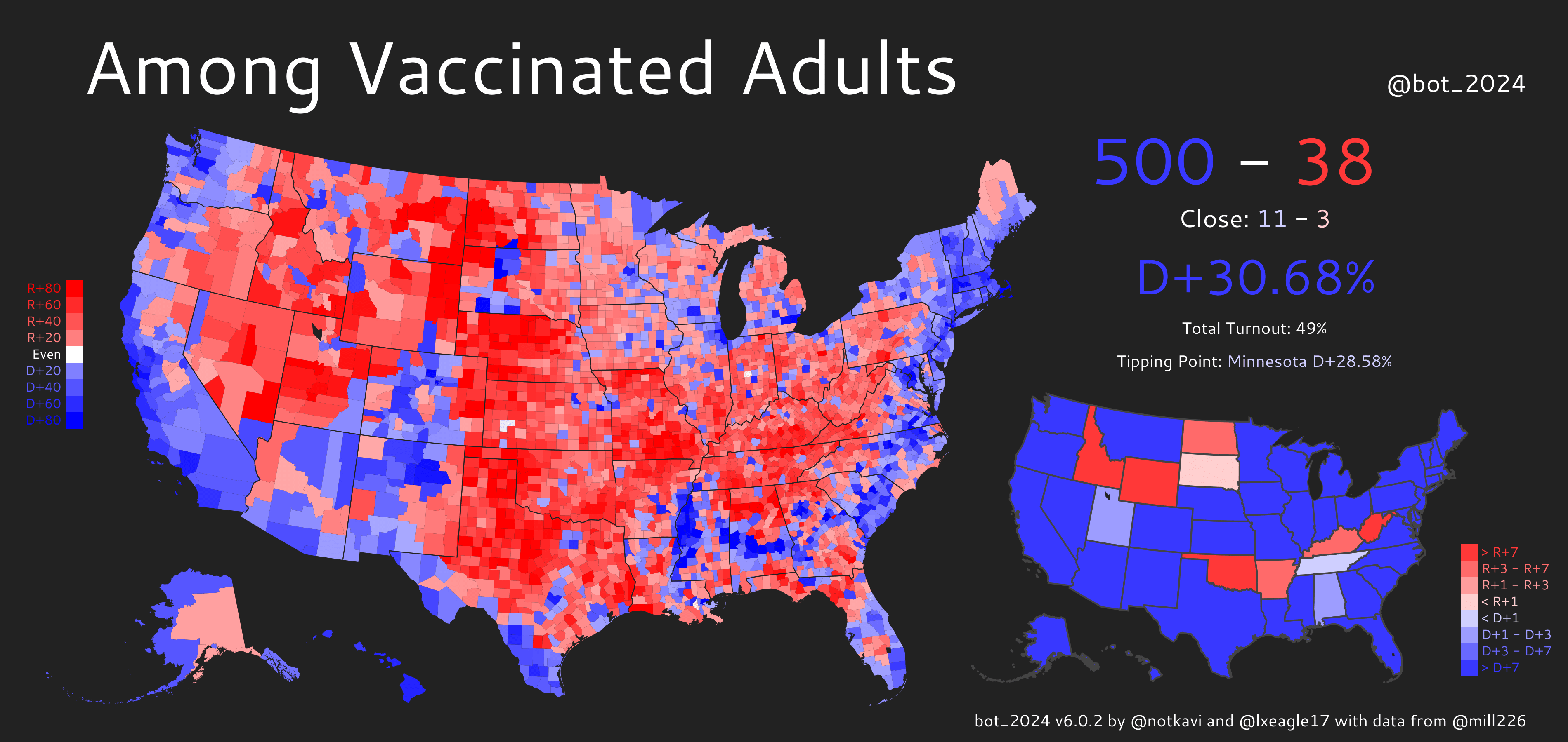
Repeating the map from the top of the article, if only vaccinated people voted, the Democrats would win in a massive 31-point landslide, winning all but 8 states and gaining 500 electoral votes. The effect is especially pronounced in the South, where Republicans are far less likely to be vaccinated.

On the other hand, if only unvaccinated people voted, the Republicans would dominate in an even larger 57-point landslide, winning every single state and losing only the District of Columbia. The only counties Democrats would win would be a couple rich, white, and very educated counties (such as Marin County, CA), a few heavily black and liberal areas in the DC/Maryland/Virginia area, some parts of Vermont, and a few of the Massachusetts coastal islands (and this part seems more like a CDC data error than anything).
Aren’t Republican politicians afraid of losing voters to COVID Deaths?
We have seen the above question asked repeatedly by both political professionals and average voters, both of which speculate on the impact of the (presumably strong) correlation between partisanship and COVID deaths. This is our estimate at quantifying the political impact of COVID fatalities –below, you will find a table with the shift in margin that each swing state would experience if there were a million COVID deaths from June 2021 onwards (which is when the vaccine became widely available). This is a bit of an extreme scenario, but it helps put some upper bounds on the situations that people speculate on.

Even in the million deaths scenario, no state has its result changed by more than 0.26%. In 2020, the closest state was Georgia with a margin of 0.24%, followed by Arizona with a margin of 0.31%, followed by Wisconsin, with a margin of 0.63%. So, even in the deadlier-than-average scenario depicted here, no states would have flipped in 2020. It is worth acknowledging that this type of extreme-deaths situation could easily flip a close race in the future, especially in a scenario like 2000, where Florida was decided by only 537 votes. However, it is simply worth pointing out that any direct changes from COVID deaths are marginal at best, and that the widely-speculated electoral demise of Republicans from COVID deaths is not nearly the median case that the layman’s discourse appears to treat it as.
It’s also worth considering the extent of the extremes described here and the knock-on impacts they would have. Firstly, the million deaths scenario is one in which Republicans continue to not get vaccinated and get hit by several waves similar in fatality to the Delta wave that hit in summer 2021. There have been about 250,000 covid deaths in the USA since the vaccine became widely available, and it is possible that there will be 750,000 more over the next year. This is, however, probably a bit worse than the median case, especially given the steady increase in vaccination uptake and the protection that the two-dose regimen would then provide against deaths and hospitalization.
However, even in this scenario, the electoral impact of COVID deaths alone is fairly slim, as our table above shows, and will very likely get drowned out by correlated factors like negative headlines from the continuation of the pandemic and a possible decrease in economic productivity, which would likely be far more counterproductive to an incumbent Democratic president electorally. In essence, it is unclear who this actually hurts – the continuation of the pandemic may kill more Republican voters, but it is possible that the continuing negative headlines and economic consequences might be of even greater electoral harm to Democrats.
*A note from the authors: Stepping away from the analysis in this article for a moment, writing the previous paragraph sent a chill down both of our spines, and not just because we casually referred to the deaths of a million people in terms of its marginal effect on an election. We can’t help but shake the impression that we are not the first people to do this analysis in calculating out the electoral impacts of allowing anti-vaccination to fester.
Do either of us think the operatives and elected officials of Fox News and the Republican Party are deliberately stoking anti-vaccination for electoral gain? Probably not. But is it reasonable to believe that folks like Tucker Carlson would be trying harder to promote vaccinations in conservative spaces if the electoral calculus above spelled doom? We can’t reasonably answer anything but yes. And the more we think of it, the more it rankles.
Methodology
We use a demographic regression to predict the four variables by county: unvaccinated Democrats, unvaccinated Republicans, vaccinated Democrats, and vaccinated Republicans. For brevity, we’ll refer to this as an area’s Partisanship/Vaccination (PV) mix. We fit this function to try to match current vaccination numbers and 2020 election results as closely as possible.
First, we take the numbers from the last 5 US election cycles between 2012 and 2020 and try to learn an underlying set of demographics from the relationship between the raw demographics (e.g. an area’s racial composition) and the voting numbers. We then try to predict an area’s PV mix as a function of the latent demographics. This leads to a decent, if imperfect model.

We can greatly improve our results, however, by slightly adjusting our technique. Currently, we predict all 4 quantities of the PV mix (vaccinated Democrats, vaccinated Republicans, unvaccinated Democrats, and unvaccinated Republicans) together. But what if we only predicted one variable (e.g. predict the number of vaccinated Democrats) and then inferred the rest of the PV mix based on the baseline data and the single-variable prediction?
It turns out that doing this for each of the four variables and averaging the results massively improves our model’s performance and helps us interpolate missing data for areas like Georgia and Vermont (neither of which is reporting accurate county level covid data, as per the New York Times page on vaccinations). We then do a topline adjustment to match the state level statistics, which are being reported accurately. This gives us an excellent baseline, and it is the model that we use.
Links and Credits
If you want the underlying data for the maps, you can find that at this spreadsheet. The code for this project can be found at this repository but be warned — it is a complete mess and will require reworking to work on anyone else’s computer.
Instead, if you have questions on methodology, please contact Kavi Gupta, the creator of the model. You can find their twitter at @notkavi, or email them at vaccinespartisanship at kavigupta.org if you have any questions.
The model, maps, and calculations for this piece were made by Kavi Gupta and build off of twitter.com/bot_2024, which was created by Kavi Gupta and Lakshya Jain.
CS PhD student and twitter mapmaker. Follow me at @notkavi on twitter.
I’m a computer scientist who has an interest in machine learning, politics, and electoral data. I’m a cofounder and partner at Split Ticket and make many kinds of election models. I graduated from UC Berkeley and work as a software & AI engineer. You can contact me at lakshya@splitticket.org